
When you go through vendor feature datasheets, you get a view of features at a very high level. It’s only once you dive deep and actually start using the software do you get a sense of how it works. The experience might sometimes yield unexpected surprises.…
So while you might have absorbed some of Sharepoint Online’s marketing hype, here are some things they failed to mention.
1) You can’t cut/copy and paste documents and folders (let alone drag and drop). Sharepoint, supposedly a sophisticated enterprise grade solution, has somehow overlooked this very elementary functionality. The way you move information in Sharepoint is by using the “send to” function, which requires you to actually type out the entire url of the destination. Convenience be dammed!

2) Designing pages using the Ribbon pane is a pain. The default editing option for designing a page in Sharepoint is the famous Microsoft “ribbon” pane. The default view is a basic WYSIWYG editor of the kind you see in blogs and wikis. You can add Sharepoint modules by going to a separate “insert” tab, which opens a new navigation with a myriad choices. Inserting modules just dumps the default views into the page. You can customize how they look, but that requires still deeper digging. In this era of usability, there is no way to simply drag and drop elements and add information. Simplicity be dammed!
3) Sharepoint Online’s structure means features within features within features. The above themes are repeated throughout Sharepoint Online. Sharepoint Online admittedly has depth of functionality, but finding features means diving through layers and layers where each feature has sub-features and more sub-features. Sharepoint Online, keeping with its enterprise legacy, almost shows an IT expert’s disdain for user friendliness.


4) Sharepoint Online is fragmented. Beyond feature accessibility, Sharepoint’s broad structure is laid out in the following manner:
A default team site section with its own navigation structure
A “my site” section a link to which is tucked away in the top right corner (not very obviously). This section has its own navigation structure with no obvious links back to the team site section.
A totally different account management console with a different url
 Usability demands that everything a user needs should be easily and intuitively accessible from a single interface. And what this interface displays should be dependent on the users’ role. For example a site admin would have ready access to the account management section, the administration section, and the portal functionality itself, while a user would have access to only portal functionality, while a group admin would have something in between. In Sharepoint’s world users do all the hard work.
5) Social features in Sharepoint Online are primitive. Though Microsoft has emphasized that social features are an important part of Sharepoint’s roadmap, the current social features can be described as Neanderthal at best. In a world of slick social tools like Facebook, where we can easily communicate and get updates on people, information and groups right on our social wall; social features of Sharepoint Online feel like managing the software administration screens of yesteryear. There is no concept of “following” specific documents or projects (you can get feeds on “tagged content”), no ability to comment on wall activities, and no concept of “groups” in the social context.
If all this daunts you, and you would rather prefer dragging and dropping for files and folders, drag and drop designing of intranet webpages, cutting edge social tools, a unified solution experience, and importantly, a solution which is pleasing to the eye – we invite you to try HyperOffice instead.


 OK, this is an
  version control, audit trails, comments, notifications and so on. As your team grows larger, you need more than a network drive where everyone just dumps documents. Our HyperOffice is an
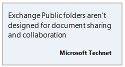
 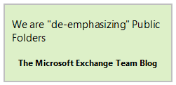 While talk of Exchange Public Folders being killed off has been around since 2006, we can be sure we are nearer than ever to that event. Microsoft itself is encouraging users to move to other Microsoft tools like SharePoint and Office 365 for sharing documents. While you want to jump from Microsoft frying pan into the Microsoft fire is another question, keeping all your eggs in the Exchange Public Folders basket is risky.
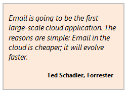 5. The cloud is where it’s at
 $104 Billion in valuation, 16 billion raised in its IPO, we can’t help but gape at this phenomena of our age with open mouths.
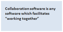 Collaboration software evidently has something to do with collaboration – or to work together. One might say that every business reduces to collaboration – humans working together to achieve a common objective. Collaboration software is therefore software which facilitates “working together”.
 I can barely control my indignation when I read articles about Google Plus as a tool for “social collaboration”. These articles sometimes come from writers I respect. I guess we have a difference of opinion on this. Here are my reasons why I think Google Plus is not a tool for social collaboration (even remotely).
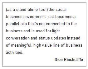 Social collaboration in the enterprise is not about networking and sharing stuff for the heck of it. In fact it means nothing if it is not connected with company information and processes. Social collaboration should not be an end in itself but subordinate to getting the job done.
 Subscribe to feed
 Follow Hyperoffice
 Become a fan
 Network with us
 Watch Videos